Accessible links, buttons and forms: quick fixes that help everyone
Form fields without labels, empty icon buttons and "click here" links confuse screen reader users. Learn the quick fixes that make your site usable for everyone.
By the WebTools team · Published 2026-11-10 · 1 min read
About one in six people lives with a disability, and everyone uses a site one-handed or in bright sunlight sometimes. A few small fixes to links, buttons and forms make your site easier for all of them, and help search engines too.
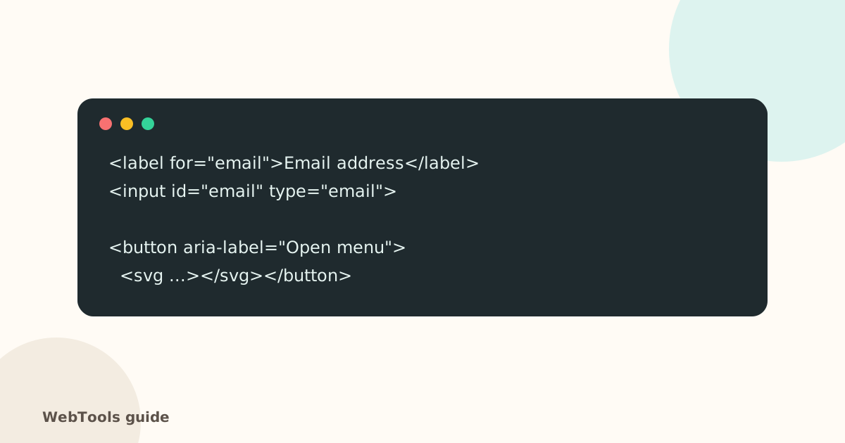
Label every form field
Each input needs a label connected to it (label for="id" matching the input's id), or an aria-label. Then screen readers announce what to type, and tapping the label focuses the field. Form plugins such as Contact Form 7, WPForms and Gravity Forms do this when you fill in the field label.
Give icon buttons a name
A button that only contains an icon (menu, search, close, cart) needs an aria-label like "Open menu"; otherwise it's read as just "button". The same goes for links that only contain an icon.
Write link text that makes sense alone
Screen reader users often jump from link to link. "Click here" and "Read more" say nothing out of context. Write "Read the pricing guide" or "Download the menu (PDF)". It's better for SEO too, because link text tells Google what the target page is about.
The other basics
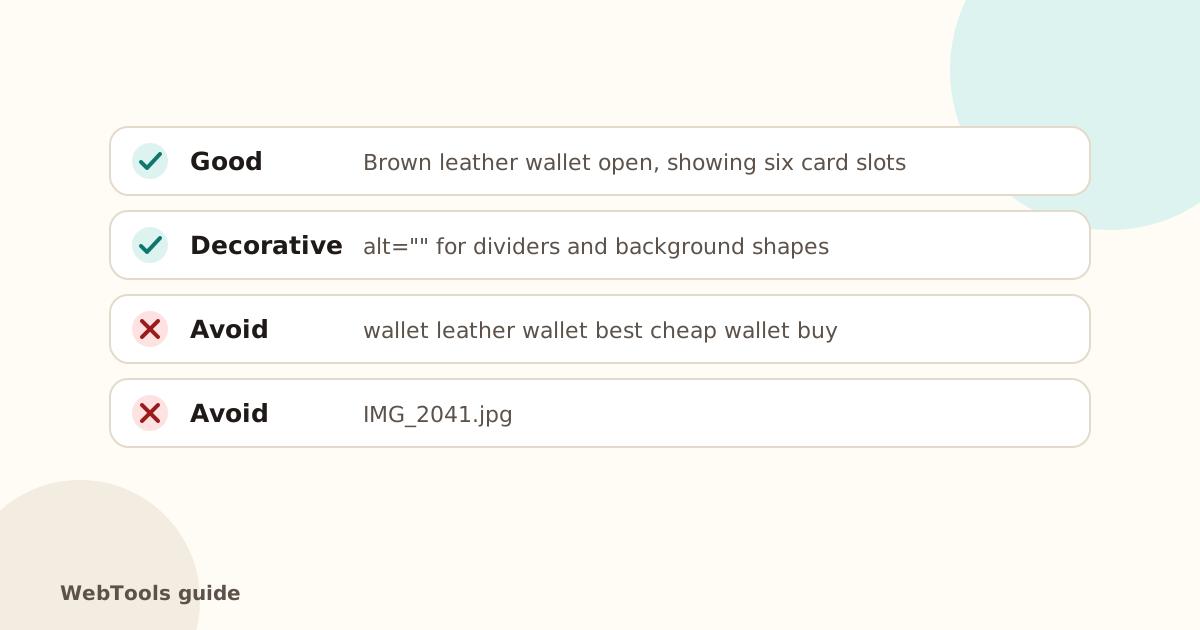
- Alt text for images.
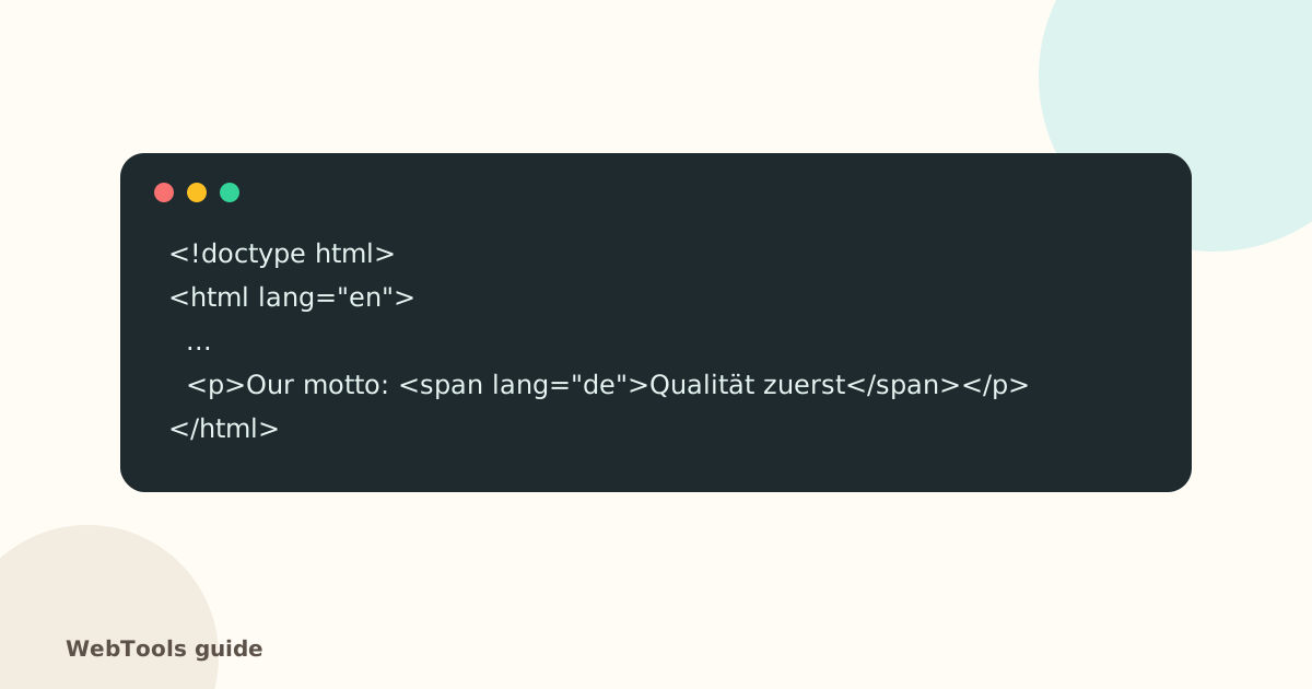
- A page language.
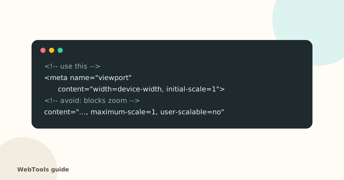
- Zoom allowed on phones.
- Headings in order.
The SEO audit finds unlabelled fields, empty links and buttons, and generic link text on every page it checks.
Questions about this topic
Is a placeholder enough as a label?
No. Placeholders disappear when you type, often have low contrast, and aren't reliably read by screen readers. Use a visible label.
Is accessibility a legal requirement?
In the EU, the European Accessibility Act applies to many online shops and services from June 2025. Requirements differ by country and business size, so check what applies to you.
Related guides
 AccessibilityThe HTML lang attribute: why your page needs a languageThe lang attribute tells browsers, screen readers and translation tools which language your page is in. Learn how to set it correctly in WordPress, Shopify and HTML.1 min read
 AccessibilityImage alt text: how to write it for SEO and accessibilityAlt text describes images for screen readers and Google Images. Learn how to write good alt text, when to leave it empty, and how to add it in WordPress, Shopify and Wix.1 min read
 AccessibilityMobile-friendly pages: the viewport tag and zoomWithout a viewport meta tag, phones show a tiny desktop page. Learn the correct viewport tag, why you shouldn't block zoom, and how to check mobile-friendliness.1 min read