Mobile-friendly pages: the viewport tag and zoom
Without a viewport meta tag, phones show a tiny desktop page. Learn the correct viewport tag, why you shouldn't block zoom, and how to check mobile-friendliness.
By the WebTools team · Published 2026-11-10 · 1 min read
Most visits now come from phones. Without a viewport meta tag, a phone renders your page at desktop width and shrinks it to fit, so visitors have to pinch and scroll sideways.
The one line you need
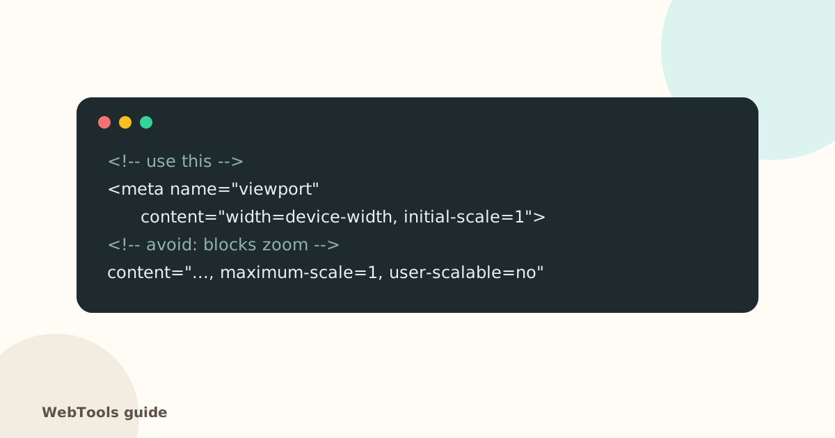
Put the viewport meta tag with width=device-width, initial-scale=1 in the head of every page. Every modern theme includes it; if yours doesn't, the theme is probably very old.
Don't block zoom
Remove user-scalable=no and maximum-scale=1. They stop people from enlarging text, which is an accessibility failure. If zooming breaks your layout, fix the layout instead.
Beyond the viewport
- Text at least 16 px, tap targets at least about 44 × 44 px.
- No content wider than the screen (tables and images should scale).
- Test on a real phone, and in your browser's device mode (F12 → device toolbar).
The SEO audit lists pages without a viewport tag and pages that block zoom. Check image sizes too: phones suffer most from heavy pages.
Questions about this topic
Does Google rank mobile-unfriendly pages lower?
Google indexes the mobile version of your site first (mobile-first indexing). Pages that are hard to use on phones perform worse.
Why shouldn't I disable zoom?
People with low vision need to enlarge text. Blocking zoom fails WCAG accessibility guidelines, and iOS ignores it anyway.
Related guides
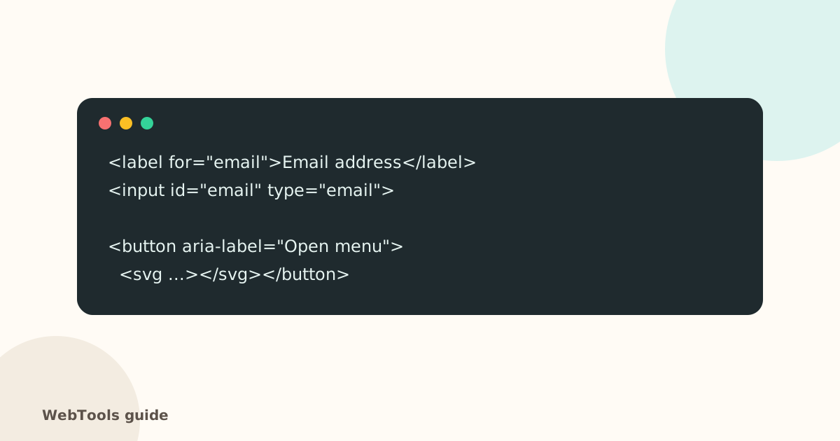 AccessibilityAccessible links, buttons and forms: quick fixes that help everyoneForm fields without labels, empty icon buttons and "click here" links confuse screen reader users. Learn the quick fixes that make your site usable for everyone.1 min read
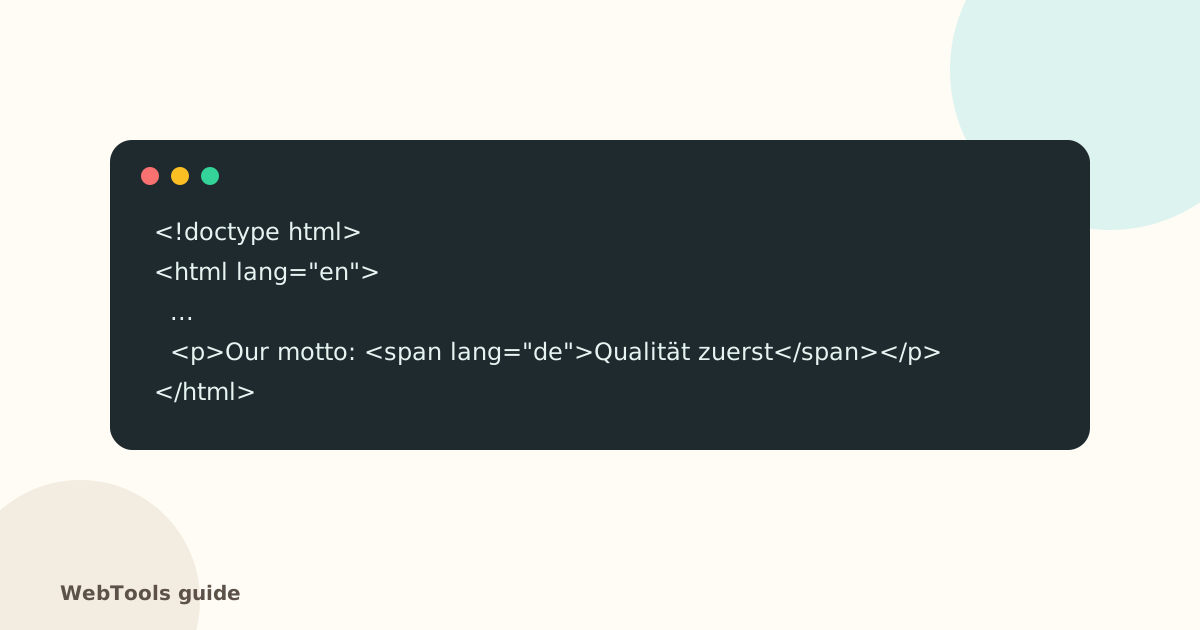 AccessibilityThe HTML lang attribute: why your page needs a languageThe lang attribute tells browsers, screen readers and translation tools which language your page is in. Learn how to set it correctly in WordPress, Shopify and HTML.1 min read
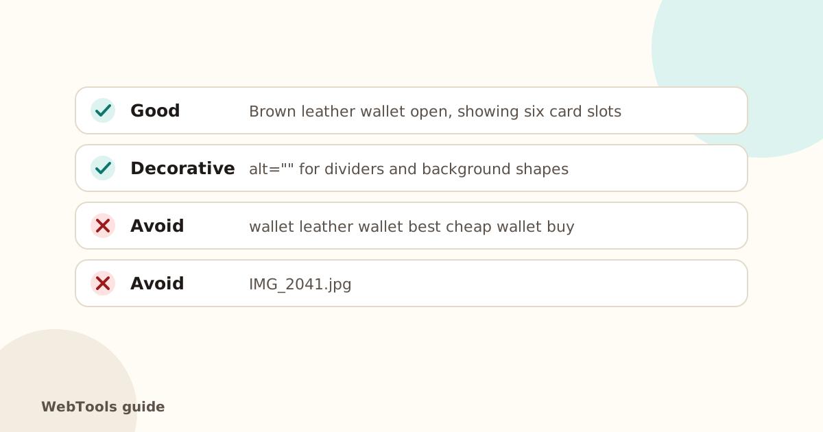 AccessibilityImage alt text: how to write it for SEO and accessibilityAlt text describes images for screen readers and Google Images. Learn how to write good alt text, when to leave it empty, and how to add it in WordPress, Shopify and Wix.1 min read